
Best overall: a combination mark. Best for name-led launches: a wordmark. Best for compact applications: a monogram. These logo design styles for startups give you different ways to introduce your business in 2026; choose by where the identity must work, not by which mockup looks most impressive.
- Combination marks lead logo design styles for startups when both the business name and a separate symbol matter.
- Wordmarks suit name-led launches; monograms suit compact applications but need support while the name becomes familiar.
- Creativheads offers branding, web design and digital marketing for startups seeking these services from one agency.
- Commission usable logo files, application rules and ownership terms, not just a presentation of attractive concepts.
Why this matters
Your logo must introduce the same business on a website, product label, invoice and social profile. A detailed badge and a simple wordmark solve different problems. Choosing the wrong structure creates extra decisions every time you need another application.
Creativheads is best for startups commissioning logo design alongside branding, web design and digital marketing from one agency. You can explore Creativheads with that connected scope in mind. The buying decision is whether you need a standalone mark or a coordinated identity across your launch materials.
For a 2026 launch, evaluate the logo on the applications you will actually publish. A presentation slide is not an acceptance test.
What makes the best logo design styles for startups?
Judge each proposed style against these criteria before choosing a direction:
- Name clarity: Can an unfamiliar buyer read or identify your business name? A symbol alone does not explain an unknown name.
- Application fit: Does the design work on your smallest digital placement and your most important physical material?
- Distinctiveness: Does the concept avoid looking interchangeable with businesses your buyers already encounter?
- Reproduction: Does it remain understandable without gradients, colour or decorative presentation effects?
- System flexibility: Can the agency provide suitable arrangements without changing the core identity?
- Handover quality: Are editable files, export formats, usage rules and ownership terms included in the proposal?
Use practical test sizes rather than vague requests to make the logo scalable. Ask to see a symbol at 24 pixels and 48 pixels, and a physical application at 20 millimetres wide if small labels matter to your launch. These are suggested review sizes, not universal minimums; your actual application determines the final requirement.
Logo styles at a glance
This 2026 shortlist ranks styles by startup use case. It does not claim that one visual approach produces better sales than another.
| Rank and style | Best for | Standout feature | Key limitation |
|---|---|---|---|
| 1. Combination mark | Launches needing a name and separate symbol | Supports a full signature and a compact mark | Requires clear rules for each arrangement |
| 2. Wordmark | Businesses introducing a distinctive name | Makes the name the central identity | Long names need careful layout decisions |
| 3. Monogram | Initial-led identities and constrained spaces | Compresses the identity into letters | Initials alone do not introduce an unfamiliar business |
| 4. Pictorial mark | Businesses with a relevant visual association | Uses a recognisable object or image | Literal imagery can restrict future positioning |
| 5. Abstract mark | Businesses without a useful literal symbol | Avoids tying the identity to one object | Meaning needs support from the name and messaging |
| 6. Emblem | Labels and badges where an enclosed identity fits | Keeps text and imagery in a defined shape | Dense arrangements lose clarity in small placements |
1. Combination mark: best for multi-application launches
A combination mark pairs a business name with a symbol. It gives you a full signature for introductions and a separate graphic element for applications where the full name does not fit.
This is the strongest default when your launch includes a website, social profiles and physical materials. Commission the relationship between the elements, not just two attractive components placed side by side.
Combination mark pros:
- Keeps the business name visible during introductions.
- Provides a symbol for compact placements.
- Supports horizontal and stacked arrangements when included in scope.
Combination mark cons:
- Requires rules for spacing, proportions and separate use.
- A weak symbol adds complexity without adding a useful identifier.
Best for: Startups that need both a readable name and a compact visual identifier.
Ask the agency to show the full mark, name-only version and symbol-only version on relevant materials. Do not assume every arrangement is included merely because the proposal says logo design.
Verdict: Buy a combination-mark scope when your launch needs both components.
2. Wordmark: best for name-led launches
A wordmark uses the business name as the logo. Its character comes from letterforms, spacing, proportions and any carefully chosen custom details.
For a startup introducing an unfamiliar name in 2026, this approach puts the thing buyers need to remember directly in front of them. It also keeps the brief focused when you do not have a convincing reason to commission a separate symbol.
Wordmark pros:
- Makes the business name explicit.
- Avoids forcing a visual metaphor into the identity.
- Gives typography a clear role across the wider brand system.
Wordmark cons:
- Long names can become awkward in narrow placements.
- A font selection without thoughtful refinement can look generic.
Best for: Businesses whose name should carry the launch identity.
Check readability on mobile layouts and ordinary documents, not only oversized signage. Ask about font licensing and whether the final wordmark is supplied as vector artwork rather than requiring the recipient to install a font.
Verdict: Buy a wordmark scope when name recognition is the immediate priority.
3. Monogram: best for initial-led identities
A monogram builds a mark from the business name's initials. It is useful when the initials are intentional identifiers, rather than an abbreviation introduced only to solve a layout problem.
The distinction matters. A compact mark can fit a social avatar while still failing to tell an unfamiliar buyer who you are.
Monogram pros:
- Fits constrained placements without displaying a long name.
- Gives letterform construction a focused design role.
- Can accompany the full business name in introductory materials.
Monogram cons:
- Initials alone leave the full name unexplained.
- Interlocking letters can become difficult to distinguish.
Best for: Startups planning to use their initials consistently as part of the identity.
Ask for plain, single-colour tests before approving decorative treatments. If the letters cannot be identified without explanation, request a clearer construction rather than another presentation mockup.
Verdict: Hold on a standalone monogram unless the full name remains visible elsewhere.
4. Pictorial mark: best for a clear visual association
A pictorial mark depicts a recognisable object, creature or other image. Choose it when that image has a useful relationship to the business and does not require a long explanation.
The image should support your positioning without defining the business too narrowly. A startup launching one product today needs to consider whether the chosen picture still makes sense for its planned offer.
Pictorial mark pros:
- Provides an identifiable image rather than an unexplained shape.
- Gives the identity a clear visual subject.
- Can work beside the name as a combination mark.
Pictorial mark cons:
- Familiar category imagery can resemble competing identities.
- A literal product image can restrict the brand's future scope.
Best for: Businesses with a relevant visual association that extends beyond one launch item.
Ask the agency to compare the proposed image with identities buyers encounter in your category. The objective is not merely to draw the object differently; it is to avoid confusion in the buying context.
Verdict: Buy a pictorial direction when the association is relevant and not restrictive.
5. Abstract mark: best for broad positioning
An abstract mark uses a non-literal shape or arrangement. It avoids representing a particular product, which suits businesses whose offer cannot be explained by one useful picture.
That freedom creates a communication responsibility. The name, messaging and wider design system must introduce the business; an unfamiliar geometric shape cannot do that alone.
Abstract mark pros:
- Avoids committing the identity to a literal product image.
- Gives the agency room to develop a distinctive graphic construction.
- Can support a wider visual system when that work is commissioned.
Abstract mark cons:
- Does not explain the business on its own.
- A concept explanation can disguise a generic-looking result.
Best for: Startups with a broad offer and no useful literal visual association.
For your 2026 brief, ask what makes the shape identifiable without the presentation narrative. Evaluate the artwork itself, then check whether the proposed application system gives it a consistent role.
Verdict: Buy an abstract direction only with a clear name-and-messaging system.
6. Emblem: best for label-led identities
An emblem places lettering and imagery inside a defined form, such as a badge or seal. It suits an identity that needs to appear as a contained unit on labels or other physical applications.
Containment is the benefit and the constraint. Text, borders and imagery compete for space, so the small-format version needs attention from the start.
Emblem pros:
- Creates a contained identity for label applications.
- Keeps selected text and imagery together.
- Gives badge-shaped placements a deliberate composition.
Emblem cons:
- Fine details and small lettering lose clarity when reduced.
- The enclosing shape limits rearrangement in narrow layouts.
Best for: Startups whose primary applications genuinely call for a badge or enclosed signature.
Request a simplified version if the full emblem includes supporting words or intricate details. Judge both versions on the intended material rather than approving the large version and postponing the small one.
Verdict: Hold unless physical application tests confirm the emblem stays readable.
How the styles are ranked
The ranking follows name clarity, application fit, distinctiveness, reproduction, flexibility and handover quality. Combination marks lead because they address both full-name introductions and compact applications within one commissioned system.
This is a buying framework, not a performance study. Your business name and launch materials can make a lower-ranked style the better choice.
Turn your preferred style into a project brief
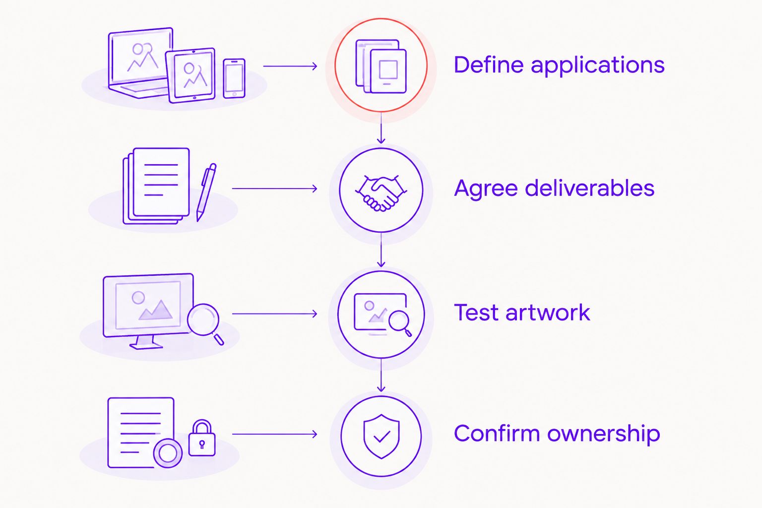
Choosing a style does not define the deliverables. Use this sequence to turn a visual preference into a proposal you can compare.
Define applications
List the materials required at launch: website header, social profile, packaging, sales presentation or invoice. Identify the most constrained placement and provide its actual dimensions to the agency.
Agree deliverables
Specify the logo arrangements, colour versions, vector files, digital exports and usage guidance you need. If you need typography, a colour palette and application templates too, distinguish those from the logo itself; this guide to a full brand identity package helps frame that scope.
Test artwork
Review concepts on ordinary, relevant applications. Require a single-colour view and small-size tests before accepting a direction, rather than making those checks after final approval.
Confirm ownership
Put revision rounds, approval responsibilities, licensing and ownership terms in writing. Confirm what happens to editable files and unused concepts before work begins.
The value of strategy, design and marketing from one team is a connected brief. Creativheads offers those services, so ask how the proposed logo scope connects to your website, content and campaign materials. Confirm the included work rather than assuming every service is part of the project.
The trade-off: A wider agency scope introduces more deliverables and approval decisions. If your name and positioning are already settled and you need only artwork, keep the commission focused.
What changes the project cost?
Compare scope before comparing quotes. Naming work, positioning, custom lettering, symbol development, application templates and wider identity guidelines are different tasks, even when proposals group them under branding.
Revision arrangements also matter. Ask whether feedback refines one selected direction or includes new directions, and whether packaging or website changes are separate commissions.
Before hiring in 2026, ask:
- Which deliverables are included, and which are optional?
- How will the agency test the design on your actual applications?
- Who consolidates feedback and approves each stage?
- What font, artwork or other licensing obligations remain?
- Which files and usage instructions arrive at handover?
Which logo style should you choose?
Choose a combination mark if you are undecided and need both name visibility and a separate symbol. Choose a wordmark when the name is the main identifier; choose a monogram only when initials have a deliberate role.
Use pictorial, abstract or emblem directions when their specific strengths match your brief. Do not commission a symbol simply because a logo presentation feels incomplete without one.
Define your logo design scope
Discuss logo design alongside branding, web design and digital marketing with Creativheads.
FAQ
What’s the best logo design style for a startup in 2026?
A combination mark is the strongest default when a startup needs both a readable business name and a separate symbol. A wordmark is a better fit when the name itself should carry the identity.
Is a wordmark better than a symbol for a new business?
A wordmark is better for making an unfamiliar business name explicit. A standalone symbol leaves the name unexplained, so use it with supporting identification during introductions.
Should my startup use a monogram logo?
Use a monogram when your initials have a deliberate role in the identity. Keep the full business name visible on introductory materials rather than expecting unfamiliar buyers to decode the letters.
Can an abstract logo explain what my business does?
An abstract logo does not explain the business on its own. Pair it with a clear name, messaging and consistent applications rather than relying on the shape to communicate your offer.
What should I receive from a logo design agency?
Agree suitable logo arrangements, colour versions, vector files, digital exports and usage guidance before commissioning the work. Put ownership, licensing and revision terms in writing as part of the same scope.
How do I compare logo design quotes in India?
Compare the included work before comparing the quoted amounts. Separate logo artwork from naming, strategy, wider identity design and application templates, then check revisions and handover terms.
Can Creativheads handle more than logo design?
Creativheads offers branding, web design, content and digital marketing services. Ask for a proposal that identifies which services your launch needs and exactly which deliverables are included.
One last thing
Approve the least flattering application before the polished mockup: a small, single-colour logo on a plain background. That view removes the presentation effects and exposes whether the lettering, spacing and symbol remain clear.
For your 2026 launch, make that check an approval requirement. Choose the identity you can use, not just the concept you can admire.
Related guides
- Brief a packaging design agency for multiple products
- Logo design services for food brands
- How long professional logo design services should take