


Best overall: mobile-first checkout. Best for purchase confidence: decision-ready product pages. Best for larger catalogues: search and filters. These are the ecommerce website features for Indian online stores to prioritise in 2026, ranked by the buying problem each solves.
- Prioritise mobile-first checkout when commissioning ecommerce website features for Indian online stores in 2026.
- Build product pages around buying questions, not just photographs and descriptions.
- CreativHeads suits brands seeking website design, brand strategy and marketing from one agency.
- Require working demonstrations, defined deliverables and launch checks before approving an ecommerce proposal.
Why this matters
A website proposal can list dozens of features without explaining what your customer will actually experience. A payment integration is not a complete checkout; a product catalogue is not a useful shopping journey.
Commission the customer journey, not a collection of feature names. Decide what buyers need to discover, understand, pay for and receive, then ask the agency to show those tasks working.
CreativHeads is best for brands seeking ecommerce website design, brand strategy and marketing from one agency. Explore CreativHeads with a defined brief, so the conversation starts with business needs rather than a visual makeover.
What makes the best ecommerce website features?
Use these criteria to evaluate your 2026 website scope before comparing proposals:
- Buying relevance: The feature answers a real customer question or removes a specific obstacle.
- Mobile usability: Customers can complete the task without awkward forms, hidden controls or unreadable information.
- Operational fit: Your team can maintain product information, fulfil orders and handle exceptions.
- Clear ownership: The proposal names who supplies content, configures integrations and approves the result.
- Verifiable completion: A working demonstration proves the feature does what the brief requires.
A feature with no owner or acceptance check is an unfinished requirement. Ask for both before signing.
Ecommerce website features at a glance
This ranking is a commissioning order, not a claim that every store needs every feature. Start with the buying journey, then add capabilities that match your catalogue and operations.
| Rank | Feature | Best for | Standout capability | Key limitation |
|---|---|---|---|---|
| 1 | Mobile-first checkout | Completing purchases on phones | Clear forms and visible order details | Depends on payment and order configuration |
| 2 | Decision-ready product pages | Explaining unfamiliar products | Buying information beside the purchase action | Requires accurate content and assets |
| 3 | Search and filters | Browsing larger catalogues | Relevant routes through product choices | Needs consistent product attributes |
| 4 | Payment choice and recovery | Handling payment uncertainty | Supported methods and clear failure states | Depends on provider capabilities |
| 5 | Delivery and policy clarity | Answering fulfilment questions | Visible delivery conditions and next steps | Needs maintained operational information |
| 6 | Order communication | Supporting customers after purchase | Clear confirmations and order updates | Depends on reliable order-status data |
| 7 | Search-ready content structure | Building organic discovery | Useful category and product pages | Does not guarantee rankings |
| 8 | Purchase measurement | Evaluating marketing activity | Recorded shopping actions and purchases | Requires validation and privacy decisions |
1. Mobile-first checkout: best for phone-based purchases
Mobile-first checkout makes the purchase process usable on a phone. It covers form layout, address entry, the order summary and the transition into payment—not just whether the page fits a smaller screen.
For your 2026 scope, ask the agency to demonstrate checkout with a realistic address and a product variation. Check error messages as carefully as the successful journey.
Mobile-first checkout pros:
- Keeps required information readable during purchase.
- Makes form errors easier to identify and correct.
- Gives the buyer a clear order summary before payment.
Mobile-first checkout cons:
- Payment-provider screens can sit outside the store's design control.
- Account rules and complex forms can still interrupt the journey.
Best for: Stores where customers need to complete purchases on phones.
Ask before hiring: Can a buyer check out without creating an account, and which fields are genuinely required?
Verdict: Buy. Treat checkout as a launch requirement, not a later design improvement.
2. Decision-ready product pages: best for unfamiliar products
Decision-ready product pages explain what the customer is buying and how to choose correctly. Depending on the product, that means materials, dimensions, variants, usage instructions or what the purchase includes.
Separate useful detail from decorative copy. A strong page puts the information needed for a decision near the buying controls, with deeper explanations below.
Decision-ready product pages pros:
- Answer product-specific questions before purchase.
- Make differences between variants explicit.
- Give photography and video a defined explanatory role.
Decision-ready product pages cons:
- Weak source information remains weak after a redesign.
- Different product categories can require different page fields.
Best for: Brands selling products that need explanation or careful selection.
Ask before hiring: Who writes the descriptions, supplies images and checks product details?
Use the website content preparation guide to define those responsibilities before design begins.
Verdict: Buy. Commission product content alongside the page template.
3. Search and filters: best for larger catalogues
Search and filters help customers find a relevant product without opening every category. Filters should reflect real buying distinctions, such as size, material or intended use—not every field available in your system.
Ask the agency to show an unsuccessful search as well as a successful one. An empty result needs a useful next step.
Search and filters pros:
- Give customers a direct route to specific products.
- Let shoppers narrow choices using meaningful attributes.
- Support browsing across a varied catalogue.
Search and filters cons:
- Inconsistent product data produces unreliable results.
- Excessive filters make the interface harder to use.
Best for: Stores with enough product variety to make browsing difficult.
Ask before hiring: Which attributes power the filters, and who maintains them when products change?
Verdict: Hold for a small, straightforward catalogue; Buy when customers need help narrowing choices.
4. Payment choice and recovery: best for payment uncertainty
Payment choice lets customers use the methods your chosen provider supports, including UPI where configured. Payment recovery explains what happens when a transaction fails, remains pending or succeeds without returning the buyer cleanly to the store.
Your 2026 brief should define payment states, not merely request a payment gateway. Cash on delivery is a separate operational decision, not an automatic requirement.
Payment choice and recovery pros:
- Makes supported payment methods clear.
- Explains failed and pending transactions.
- Connects payment status to the correct order status.
Payment choice and recovery cons:
- Provider capabilities constrain the available experience.
- Cash on delivery needs its own fulfilment and verification process.
Best for: Stores that need clear handling of payment exceptions.
Ask before hiring: What will the customer see after a failed payment, and how will staff identify a pending transaction?
Verdict: Buy. Approve the exception journeys alongside the successful payment journey.
5. Delivery and policy clarity: best for fulfilment questions
Delivery and policy clarity tells buyers where delivery applies, which conditions matter and how returns or exchanges work. The website should display your actual policies, not generic wording copied from another store.
If you commission a postcode check, define what it confirms. Delivery eligibility and an estimated delivery date are different promises.
Delivery and policy clarity pros:
- Answers practical questions before checkout.
- Makes delivery restrictions visible.
- Gives customers a clear route to policy information.
Delivery and policy clarity cons:
- Outdated operational information creates misleading expectations.
- Detailed delivery estimates require dependable supporting data.
Best for: Stores with delivery restrictions or product-specific return conditions.
Ask before hiring: Who approves policy wording, and where will buyers see exclusions before ordering?
Verdict: Buy. Publish accurate conditions before adding sophisticated delivery estimates.
6. Order communication: best for post-purchase support
Order communication confirms the purchase and explains what happens next. Scope the order confirmation, dispatch update and support route as distinct customer messages.
Tracking links are useful only when they refer to the correct shipment. Ask how the store receives dispatch information and who handles an incorrect or missing update.
Order communication pros:
- Gives buyers a purchase record.
- Explains the next step after ordering.
- Provides a consistent route for order-related help.
Order communication cons:
- Notifications depend on accurate order-status changes.
- Messaging channels require configuration and ongoing ownership.
Best for: Brands that need a defined customer experience after payment.
Ask before hiring: Which messages are included, what triggers them, and who can edit the wording?
Verdict: Buy. Start with reliable confirmations before adding more communication channels.
7. Search-ready content structure: best for organic discovery
Search-ready content structure gives each category and product a useful, understandable page. It includes clear page names, relevant written content and links that help visitors move between related choices.
A redesign that changes existing page addresses also needs a migration plan. Ask which pages will remain, which will change and how old addresses will lead to their replacements.
Search-ready content structure pros:
- Organises pages around actual shopping needs.
- Gives each category a distinct purpose.
- Includes existing search visibility in redesign decisions.
Search-ready content structure cons:
- Technical setup cannot replace useful content.
- Similar products need careful handling to avoid repetitive pages.
Best for: Stores investing in discoverability beyond paid advertising.
Ask before hiring: Does the proposal include page mapping, content responsibility and checks after launch?
Verdict: Buy. Treat search structure as part of the build, not an unspecified add-on.
8. Purchase measurement: best for marketing accountability
Purchase measurement records shopping actions and completed transactions so your team can evaluate marketing activity. Define the questions the reporting must answer before asking for a dashboard.
CreativHeads combines website design and digital marketing services; that positioning suits a brief connecting the store experience with campaign reporting. Request the actual measurement scope in the proposal.
Purchase measurement pros:
- Connects website activity with defined business questions.
- Supports checks on campaign-to-purchase journeys.
- Gives teams a shared basis for discussing results.
Purchase measurement cons:
- Incorrect configuration can duplicate or miss transactions.
- Consent choices and platform differences limit complete attribution.
Best for: Brands investing in marketing that needs purchase-level evaluation.
Ask before hiring: How will the team verify transaction identifiers, purchase values and duplicate prevention?
Verdict: Buy. Require validation, not just installation.
How the features are ranked
Checkout comes first because it is the purchase endpoint. Product information and discovery follow because customers need to understand and find what they want before paying.
The remaining features cover payment exceptions, fulfilment, customer communication, discovery and measurement. Change the order when your existing store has a clearly identified problem; do not replace diagnosis with a universal wishlist.
Turn the shortlist into a website brief
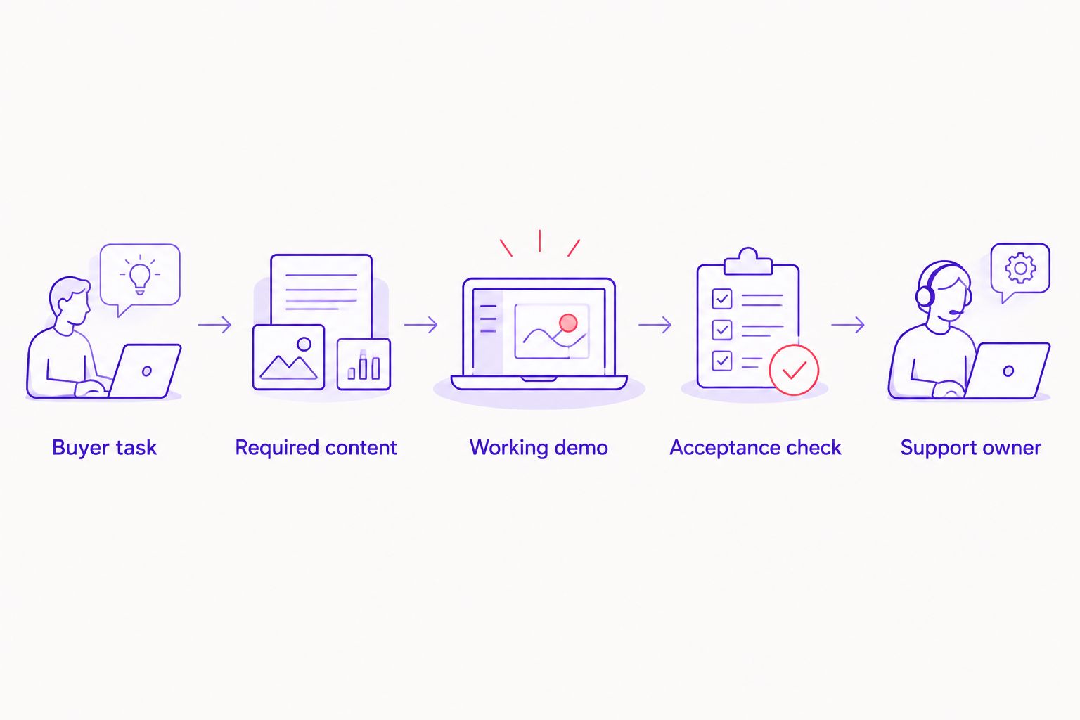
For a 2026 launch or redesign, use this sequence to turn feature names into work you can approve:
- Buyer task: Describe what the customer must accomplish.
- Required content: List the information, images and policies needed.
- Working demo: Specify the journey the agency must demonstrate.
- Acceptance check: Define how your team will confirm completion.
- Support owner: Name who maintains the feature after launch.
Each requirement should connect a customer action to a clear handover. That makes competing proposals easier to compare.
Ask for 3 test orders before launch: a successful payment, a failed payment and a cancelled purchase. Review the journey on 2 device types, a phone and a desktop computer. Assign 1 named owner to approve each customer-facing policy. These are recommended acceptance checks, not performance benchmarks.
Also separate design work from integration work. Catalogue preparation, photography, copywriting, custom connections, content migration and post-launch support all change project scope; ask which are included and which need a separate agreement.
Define your ecommerce website scope
Discuss website design, content and marketing requirements with CreativHeads.
Which ecommerce website features should you choose?
Choose mobile-first checkout and decision-ready product pages as the default starting point. Add search when catalogue complexity demands it, and commission payment, delivery and order communication around your actual operations.
For your 2026 proposal, distinguish launch essentials from later improvements. A smaller scope with complete content, tested journeys and clear ownership is easier to approve than a long list of loosely defined capabilities.
FAQ
What are the best ecommerce website features for Indian online stores?
Mobile-first checkout and decision-ready product pages are the best starting point. Add search, payment recovery, delivery clarity, order communication, search-ready content and purchase measurement according to your catalogue and operations.
Does an Indian ecommerce store need UPI payments?
Include UPI when your chosen payment provider supports it and it fits your payment requirements. Ask the agency to demonstrate successful, failed and pending payment states rather than approving a payment-method logo alone.
Should my ecommerce website offer cash on delivery?
Offer cash on delivery only when your operations can support the process. Define order verification, fulfilment rules and customer communication before adding it to checkout.
Is search necessary for a small online store?
Search is not automatically necessary for a small, straightforward catalogue. Prioritise clear categories and product pages, then add search when customers need a faster route through more choices.
What changes the scope of an ecommerce website project?
Catalogue preparation, content creation, custom integrations, migration and post-launch support change the project scope. Ask proposals to separate these responsibilities so you can compare equivalent deliverables.
Can one agency handle ecommerce website design and marketing?
Yes. CreativHeads offers website design, branding, content and digital marketing services; define the deliverables for each service so shared responsibility does not become unclear responsibility.
What should I check before approving an ecommerce website launch?
Check the complete purchase journey, payment exceptions, product information, delivery conditions, order messages and purchase measurement. Require working demonstrations and a named owner for any unresolved launch issue.
One last thing
Test what happens when a customer does not complete the expected journey. An invalid address, failed payment or empty search reveals requirements that polished page previews do not show. Put those situations in the brief before approving the build.
Related guides
- Ecommerce website development timelines in India
- Website redesign support after launch
- Comparing performance marketing agency proposals